
<

However, after introducing digital gold investment on the app, the team noticed design inconsistencies and a lack of scalability. In order to make the system more intuitive and scaleable, the design team underwent several iterations and user interviews over the course of a few months.
In mid-2021, I joined Spenny as a senior designer and was given the responsibility of leading the design team, establishing design processes, set up design guidelines and redesigning the current experience.
My role involved designing guidelines, UI components, and crafting the overall user experience. Throughout the process, I worked closely with engineers, co-founders, and project managers to ensure a smooth and successful design cycle.
1 product manager, 4+ engineers and 2 co-founders
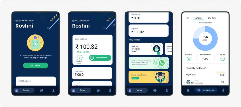
Speaking of roundups, this feature allowed users to round up their digital purchases and automatically invest the amount difference into their portfolio. It was all managed within the portfolio tab, along with any roundup settings.
In this iteration, we made some visual design improvements and began experimenting with 3D illustrations. To streamline our design process and ensure consistency, we designed a basic component system and established guidelines for colors, typefaces, spacings, and iconography.

Based on user feedback and inputs from our business team, we implemented the following changes in this iteration:
Move the withdraw CTA from the home to the portfolio tab to avoid displaying it as prominent option on the home screen. This allows the user to access the withdraw CTA if needed, without feeling tempted by its upfront presence.
With the addition of digital gold, we added a element on the home screen to view the total balances of both assets by tapping on the circular button.
To assist users in managing their pending actions, we added TODO cards on the home screen. These cards serve as reminders and allow users to easily pick up where they left off the last time.

We added a "Recent orders" section to the home screen to make it easy for the users to check the status of their recent order.
In an effort to increase user trust, we added a "Roundup cart" section on the home screen. This allowed the users to see whether their last digital transaction was rounded up or not.
We divided the Roundup details and Investment details into separate tabs. We also added a separate tab for Roundup settings to ensure simplicity and ease of use.
We also included "Invest" & "Withdraw" CTAs in the portfolio tab. These were not present in the previous iteration.

After shipping this design, we started gathering feedback from our users. While we were pleased to learn that we were able to address some of the challenges our users were experiencing, we also received critical feedback during this process.
The portfolio toggle element that we designed wasn't intuitive enough for some users, and some weren't even aware that they could view the balances of both the assets on the home screen.
In the portfolio section, it wasn't clear whether the invest & withdraw CTAs would take users to mutual fund flow or digital gold flow
Help and support page was not easily discoverable.
Multiple CTAs on the home screen was confusing for users, causing their attention to be divided and leading to a cluttered and overwhelming experience.
There were no dynamic sections in the app for us to display important information or marketing campaigns.
We also aimed to have a single primary call-to-action (CTA) on the home screen that could be customized for various user needs.
For instance, if a user needs to complete the KYC, then the primary CTA and the accompanying design will lead the user to the KYC process. Similarly, if user’s last payment has failed, the primary CTA will lead the user to complete the payment.

Based on user feedback and inputs from our business team, we introduced the following changes in this iteration:
Dynamic banners for important updates and marketing offers on the home screen
Single primary CTA on the home screen
Help and support section on the home screen
To make the experience more organized and streamlined, we implemented a horizontal card layout on the home screen to organize our elements. Here's an explanation of each card:


To reduce the number of drop-off rates in the onboarding process, we reduced the number of steps required, additionally, we introduced a new offer flow called "Get Gold" as an incentive for users to get started and explore the app.
The first fold of the home screen was designed to guide new users through the KYC and AutoPay processes. Since portfolio value may not be relevant to a fresh user, we have chosen not to display it at this stage.
To make the app easy to use and visually appealing, we implemented a clear layout with better-quality graphics and intuitive navigation.
Introduced a new section, named "Explore" to provide our users with starting guides, show product updates and marketing content.
To prioritize investment options, we placed them at the forefront of the screen using a bottom sheet design that can easily be scaled to include more assets in the future. On the second-to-last fold, we added FAQs with a CTA that leads to the "Help and Support" screen.
Finally, we added a "How Does Spenny Work?" card with a marketing graphic at the bottom of the screen for users who may scroll down. Our team was satisfied with the final designs and received positive feedback from users.
Upon talking with our users, we learned that they were not satisfied with the way investment options were presented. We also had doubts about its discoverability and the number of steps required for a user to reach the investment screen for each product.
As we introduced Wise, we recognized the need to update our home screen to showcase the new investment asset, which made it more interesting, as it presented an opportunity for us to revisit the design and make any necessary improvements based on past experiences and tradeoffs.
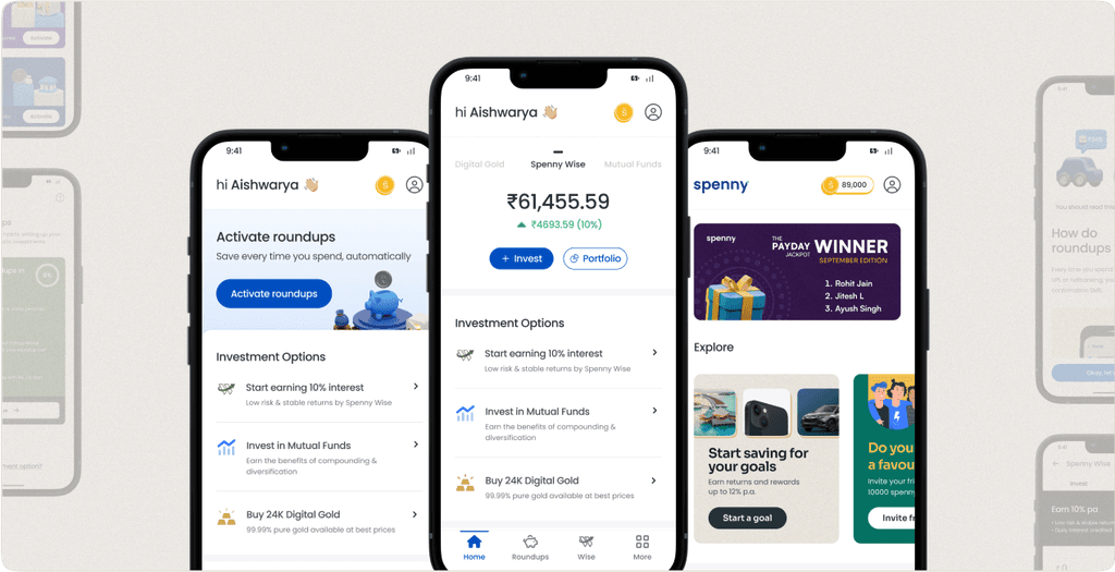
In this iteration, we introduced a few new components to the home screen
To adhere to our 1-CTA design guideline, we have placed the "Activation process CTA" at the top of the screen for new users. This ensures that the CTA is easily accessible and prominent for the users.
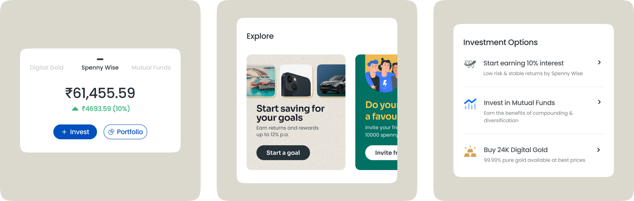
To address the challenge of displaying asset portfolio values on the home screen, we introduced a "Scrollable Horizontal Portfolio Navigator" component. This component displays the portfolio value of a single asset at a time, with a primary CTA of "Invest" and a secondary CTA of "Portfolio". Other asset options can be seen to the right and left, indicating to the user that they can click on them or scroll to see more details.
Based on feedback from users and our support team, we moved the investment options even further to the forefront of the first fold on the home screen.
For business, knowledge, and marketing purposes, we added a dynamic banner section in the second fold of the screen, along with the "Explore" section, which includes a variety of information on knowledge, marketing and new product launches.
We introduced a new “bottom navigation” element that includes: Home, Roundups, Wise and More tabs. The "More" tab was added to accommodate all investment assets with future scalability in mind.
Later on, when we released our revamped referral and rewards program, we introduced a "Spenny Coin" for the rewards and added it to the top of the screen.
“ Our latest home screen design is the most user-friendly yet, and has become the basis for designing other parts of the app. We've been able to easily incorporate additional features into this design, proving its ability to scale with the growth of the app. Overall, this design has proven to be most intuitive and effective till date. ”


Impact
With the final iteration of the redesign process, we were not only able to fulfill the business and product requirements, but also establish a foundation for our new design guideline. This allowed us to scale quickly and efficiently release new features, such as SIP in Wise, referral and rewards program, goal-based investments, and physical gold coins.
The redesign led to a significant reduction in the number of user experience issues and UI bugs, as well as a decline in the number of customer support cases. This suggests that users are having a positive experience investing with us.
We were able to improve our ability to promote marketing and business updates. Each product now has its own dedicated screen, which includes a section for important alerts and updates related to KYC processes and investments. The streamlined navigation makes it easy for users to access this information. The app is now more organized and no longer feels cluttered or overwhelmed with information.
These progressive design iterations led to increase in play store rating from 3.9 to 4.4 and significant decrease in drop-off rates.
just wanna hangout for a coffee? Drop an email
or a message.